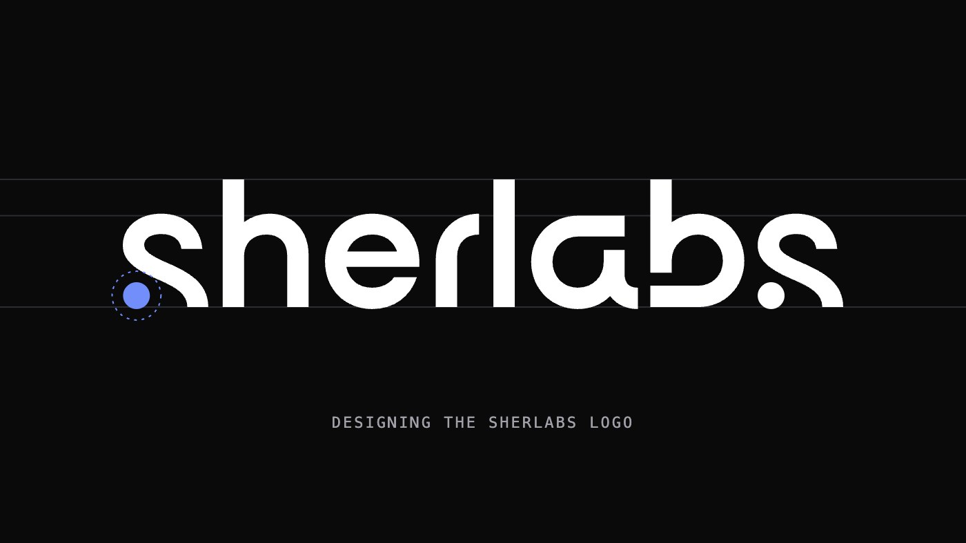
A studio logo has an awkward job. It has to sit quietly in a 16-pixel browser tab, hold its own as a hero across a laptop screen, and look like it belongs next to apps as different as a reel organiser and a family photo tool. It can't lean on one product's look, because there will be more products.
The Sherlabs mark answers that with very little: a lowercase wordmark drawn with one stroke weight, two dots, and one colour. This post walks through the thinking behind each of those choices, with the real numbers from the master SVG.
Lowercase, on purpose
Every letter in the wordmark is lowercase, including the first. Capitals read as formal: a bank, a law firm, an institution. Sherlabs makes small apps for personal things like saved recipes and photos of your kids, so the name should read the way you'd type it to a friend.
Lowercase also gives the mark a recognisable outline. The ascenders of the h, l and b rise out of the word at regular intervals and make a skyline you can spot even when the logo is too small to read.
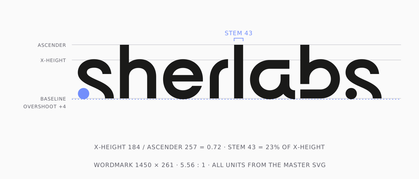
The proportions are set for that. The wordmark is drawn on a 1450 × 261 unit canvas, a 5.56 : 1 rectangle, wide enough to sit comfortably in a header and still be legible on a phone. The x-height is 184 units against an ascender of 257, a ratio of 0.72. That's a big x-height, the same trick friendly interface typefaces use: the bodies of the letters stay large, so the word stays readable when it's scaled down.
One stroke weight
Every vertical in the mark, from the stem of the h to the l to the back of the b, is exactly 43 units wide. The curves are drawn to the same weight. There are no thick-and-thin contrasts, no serifs, no flourishes.
A single weight is what lets the logo shrink. Contrast in a letterform is the first thing to disappear at small sizes: thin strokes break up into grey mush while thick ones survive. With one weight throughout, the whole word degrades evenly. At 43 units against a 184-unit x-height, the stroke is 23% of the letter height, heavy enough to feel confident without filling in the counters.
Open letterforms
Look closely and most letters are a little open. The stem of the b stops short of the baseline, leaving a small notch where it would meet the base of the bowl. The a is a single-storey form with a small spur kicking out at the bottom right. The r is just a stem and a quarter arc. The e ends on a clean horizontal cut instead of curling back on itself.
Open shapes keep the counters (the spaces inside letters) generous, which again helps at small sizes. They also give the mark a sense of motion, as if each letter flows into the next. It's a small, quiet way of saying the work is never quite finished: these are products we keep shipping.
Optical corrections
Geometry alone doesn't look right, so the mark cheats in the places your eye expects it to.
Round letters overshoot. The bowls of the e and a dip 4 units below the baseline, and the curved tops of the h and e rise 4 units above the flat top of the a. Without that, round shapes look shorter than flat ones next to them, because a curve touches a line at only one point.
The spacing isn't uniform either. The gaps between letters range from 25 units (between the a and b) to 33 (between the h and e). Each pair is spaced by eye, so that the areas of white between letters feel even, not the distances.
The two dots
The most distinctive part of the mark is what happens to the s.
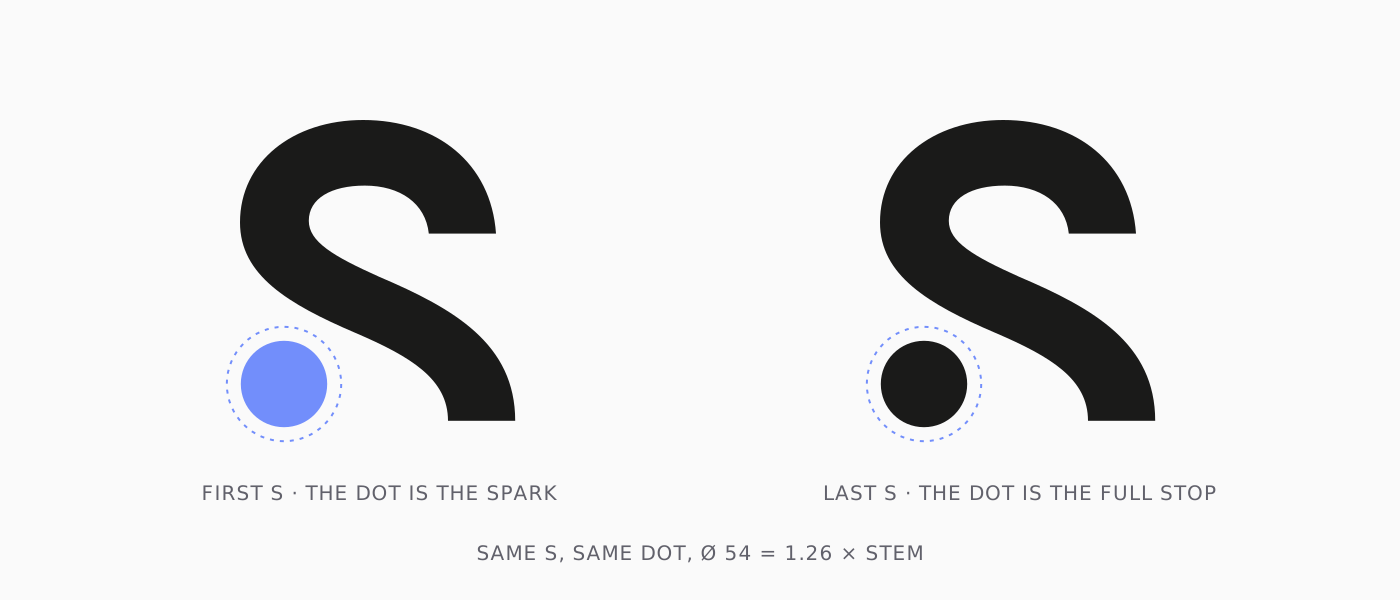
The S is drawn without its lower curl. Where the stroke would normally sweep back to the left at the bottom, it stops, and a dot sits in its place. The dot is 54 units across, about 1.26 times the stroke, so it reads as a deliberate shape rather than a full stop that drifted in.
Sherlabs starts and ends with an s, and the same S is used at both ends: the final one is the exact same path, moved 1,278 units to the right. What changes is the dot.
- The first dot is blue. It's the spark at the start of the name, the only colour in the whole mark.
- The last dot is ink, the same colour as the letters. It closes the word like a full stop.
Start with an idea, finish the thing. That's the closest the logo gets to a slogan.
The icon
The app icon and favicon keep only the opening S and its blue dot.
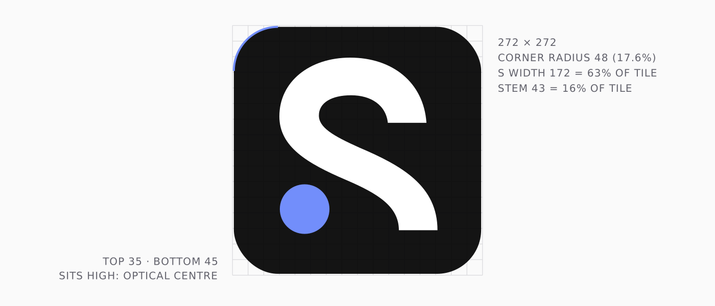
It sits on a 272 × 272 tile with a 48-unit corner radius, 17.6% of the side: clearly soft, a little tighter than an iPhone app icon, so it looks at home beside them without pretending to be one. The S is 172 units wide, 63% of the tile, which leaves enough margin for the rounded corners to breathe.
The S isn't vertically centred. It has 35 units above and 45 below. The dot and the heavier lower half of the letter weigh the shape down, so the mark is nudged upward to sit on the tile's optical centre. Mathematically centred, it looks like it's sinking.
The single stroke weight earns its keep here. At 43 units on a 272 tile, the stroke is 16% of the icon. In a 16-pixel browser tab that's still a 2.5-pixel line, so the S stays an S.
A single blue
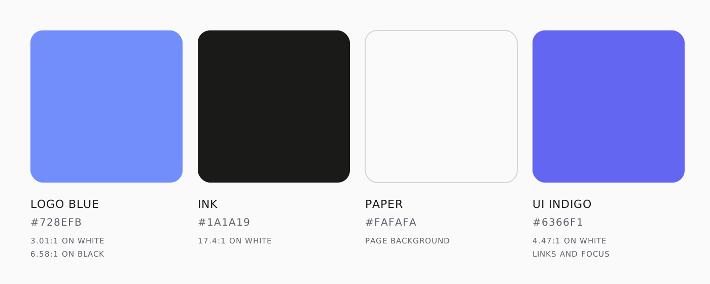
The mark uses one colour, and uses it once.
- Logo blue, #728EFB. A light periwinkle: hue 228°, very saturated, fairly light. It's friendly rather than corporate, and it doesn't belong to any one product. The apps keep their own colours, like AutoShare's coral, and this blue sits comfortably beside them.
- Ink, #1A1A19. Not pure black. A very slightly warm near-black, which looks softer on screen than #000.
- Paper, #FAFAFA. An off-white for the page, so white cards and the light icon tile can still stand off it.
The logo blue has one limitation, and it was a deliberate trade. It measures 3.01 : 1 against white. That passes the WCAG threshold for graphics, so the dot is fine on light backgrounds, but it's too light for small text. So the website doesn't use it for interface text. Text selection, focus rings and the small square markers on section labels use a deeper indigo, #6366F1, at 4.47 : 1 on white. On dark backgrounds the logo blue does much better, at 6.58 : 1 against near-black.
Keeping the logo blue for the logo, and a working blue for the interface, means the brand colour stays special. It only ever shows up as that one dot.
Drawn, not typed
The final mark contains no font. Every letter is an SVG path, and the whole wordmark is 1.7 KB in both its light and dark versions. Nothing depends on a typeface being installed or loading in time, and there's nothing to substitute if it doesn't.
There are four files, and that's the whole kit:
sherlabs-wordmark-dark.svgandsherlabs-wordmark-light.svg: ink or white letters on a transparent background, both with the blue dot.sherlabs-icon-light.svgandsherlabs-icon-dark.svg: the S and dot on a white or black tile.
The rules for using them are short. Never stretch the 5.56 : 1 rectangle. Keep at least one dot's width of clear space on every side. Never recolour the first dot, and never add a second colour.
What we'd tell anyone designing a small brand
- Design for the smallest size first. If it works as a 16-pixel favicon, it will work everywhere else.
- Fewer weights, fewer colours. Every extra one is something that can break when the logo is shrunk, inverted or printed.
- Let one detail carry the personality. Here it's a single dot. Everything else stays out of its way.
- Trust your eyes over the grid. Overshoot, optical spacing and an off-centre icon all look wrong on paper and right on screen.